Bars
The Bars mark provides the following features:
- Plot a single or multiple arrays of y-values for a single array of categorical x-values
- Support for horizontal bar charts
- Support for stacked and grouped bar charts
Attributes
Data Attributes
Style Attributes
Let's now look at examples of constructing bar charts using the pyplot API
pyplot
The function for plotting bar charts in pyplot is plt.bar. It takes two main arguments:
- x vector of x values
- y vector of y values (For stacked/grouped bar charts
yshould be a list of arrays or a 2-d array)
For further customization, any of the attributes above can be passed as keyword args.
Code Examples
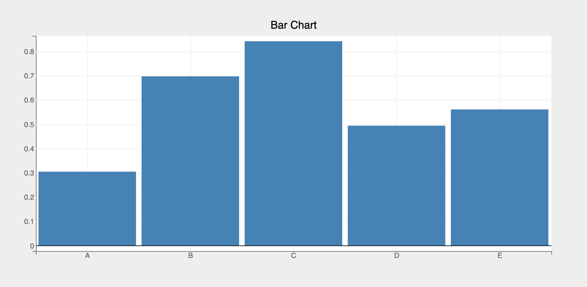
Simple Bar Chart
import bqplot.pyplot as plt
import numpy as np

fig = plt.figure(title="Bar Chart")

x = list("ABCDE")
y = np.random.rand(5)

bar = plt.bar(x, y)

fig
Tip
To render bar charts professionally it's better to disable x grid lines. Also set the opacity to be slightly less than 1 to make the bars a bit transparent, like so:
Attributes can be updated in separate notebook cells or in callbacks when an event is triggered!
Bar Spacing
Use the padding attribute (between 0 and 1) to increase or decrease the spacing between bars.
padding values close to 0 means almost no padding between bars, thereby making the bars fat!
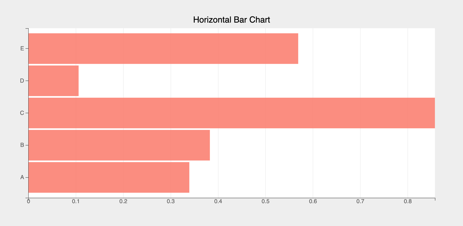
Horizontal Bar Chart
Use plt.barh method to create a horizontal bar chart, like so:
fig = plt.figure(title="Horizontal Bar Chart")

x = list("ABCDE")
y = np.random.rand(5)

axes_options = {"x": {"grid_lines": "none"}}
bar = plt.barh(x, y, colors=["salmon"], axes_options=axes_options, opacities=[.9])

fig
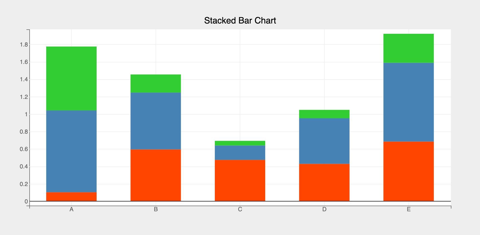
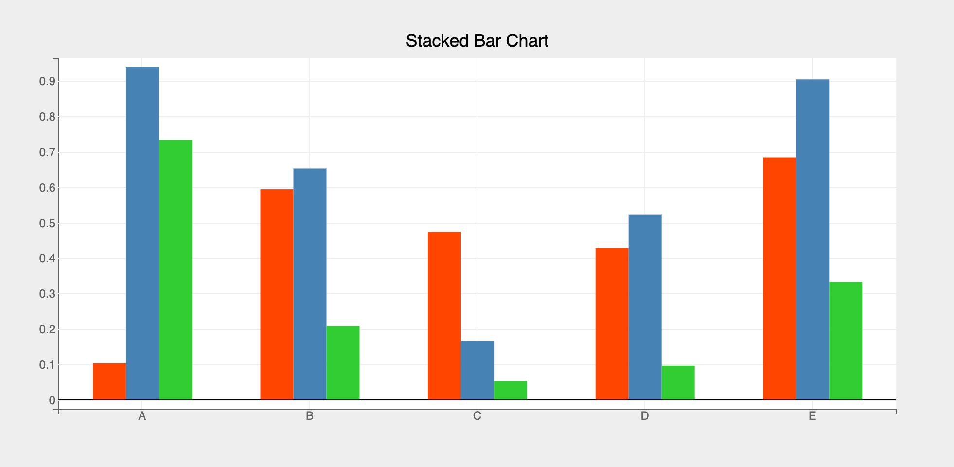
Stacked/Grouped Bar Charts
Use the type attribute for stacked/grouped bar charts, like so:
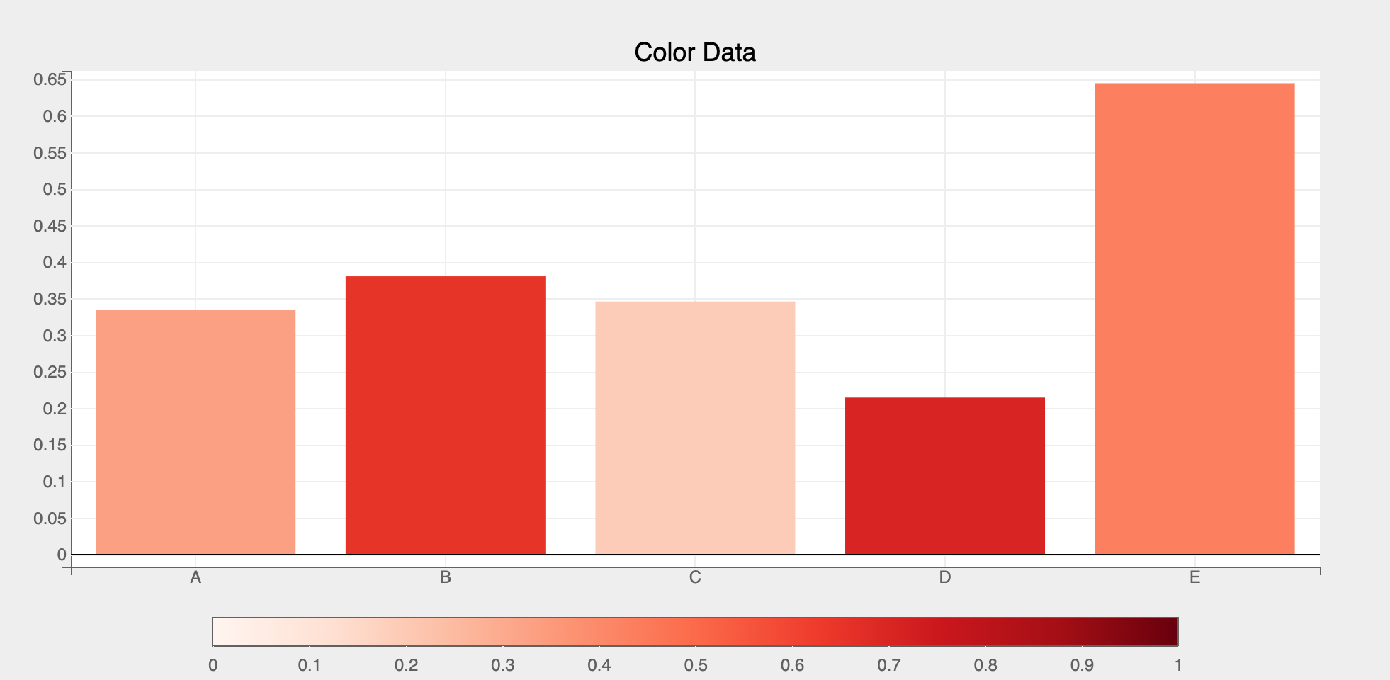
Using color data attribute
Using color data attribute we can encode a third dimension (apart from x and y) using color scales, like so:
import bqplot as bq

# provide enough bottom margin to accommodate the color bar
fig = plt.figure(fig_margin = dict(top=50, bottom=80, left=50, right=50))

x = list("ABCDE")
y, color = np.random.rand(2, 5)

# add a 'reds' scheme color scale
plt.scales(scales={"color": bq.ColorScale(scheme="Reds", min=0, max=1)})

bar = plt.bar(x, y, color=color, padding=0.2)

fig
Interactions
Tooltips
Tooltips can be added by setting the tooltip attribute to a Tooltip instance
import bqplot as bq

fig = plt.figure()
x = np.arange(1, 11)
y = np.random.rand(10)
tooltip = bq.Tooltip(fields=["x", "y"], formats=["", ".2f"])
bar = plt.bar(x, y, tooltip=tooltip)
fig
Selecting Bars
Discrete bar(s) can be selected via mouse clicks or a continuous set of bars can be selected by using Selectors.
The selected attribute of the bar mark will be automatically updated in both the cases. Note that selected attribute is a list of indices of the selected bars!
Tip
Use the selected_style and unselected_style attributes (which are dicts) to apply CSS styling for selected and un-selected bars respectively
Callbacks can be registered on changes to selected attribute.
To select discrete set of bars set interactions = {"click": "select"}. Single bar can be selected by a mouse click. Mouse click + command key (mac) (or control key (windows)) lets you select multiple bars.
fig = plt.figure()
x = list("ABCDEFGHIJ")
y = np.random.rand(10)
bar = plt.bar(x, y,
            interactions={"click": "select"},
            unselected_style={"opacity": "0.5"})

# callback to invoke when points are selected
def on_select(*args):
    selected_indices = bar.selected
    if selected_indices is not None:
        selected_x = bar.x[selected_indices]
        selected_y = bar.y[selected_indices]

        # do something with selected data
        print(selected_x, selected_y)

# register callback on selected attribute
bar.observe(on_select, names=["selected"])

fig
Use BrushIntervalSelector to select bars in a continuous rectangular range. Check Selectors page for more details on how to setup and use various selectors.
Let's look at an example.
import bqplot as bq

fig = plt.figure()
x = list("ABCDEFGHIJ")
y = np.random.rand(10)
bar = plt.bar(x, y, unselected_style={"opacity": "0.3"})
xs = bar.scales["x"]

selector = bq.interacts.BrushIntervalSelector(scale=xs, marks=[bar])
fig.interaction = selector

# callback to invoke when points are selected
def on_select(*args):
    selected_indices = bar.selected
    if selected_indices is not None:
        selected_x = bar.x[selected_indices]
        selected_y = bar.y[selected_indices]

        # do something with selected data

# register callback on selected attribute
bar.observe(on_select, names=["selected"])

fig
For an advanced real world example of slicing datasets using bar charts, checkout the Logs Analytics dashboard in bqplot-gallery.
Example Notebooks
For detailed examples of bar plots, refer to the following example notebooks