Scatter
The Scatter mark provides the following features:
- Multi-dimensional scatter chart with with support for data attributes encoding
x,y,color,sizeetc. - Support for various marker types (circle, square, diamond etc.)
- Interactive updates with the ability to add new points by clicking on the chart, update points by moving the points etc.
- Filter data by using brush selectors
Attributes
Data Attributes
Style Attributes
pyplot
The function for plotting scatter charts in pyplot is plt.scatter. It takes two main arguments:
- x 1d array of x values
- y 1d array of y values
For further customization, any of the data/style attributes above can be passed as keyword arguments.
Code Examples
Simple Scatter Chart
import bqplot.pyplot as plt
import numpy as np

fig = plt.figure()

x, y = np.random.rand(2, 20)
scatter = plt.scatter(x, y, stroke="black")
fig
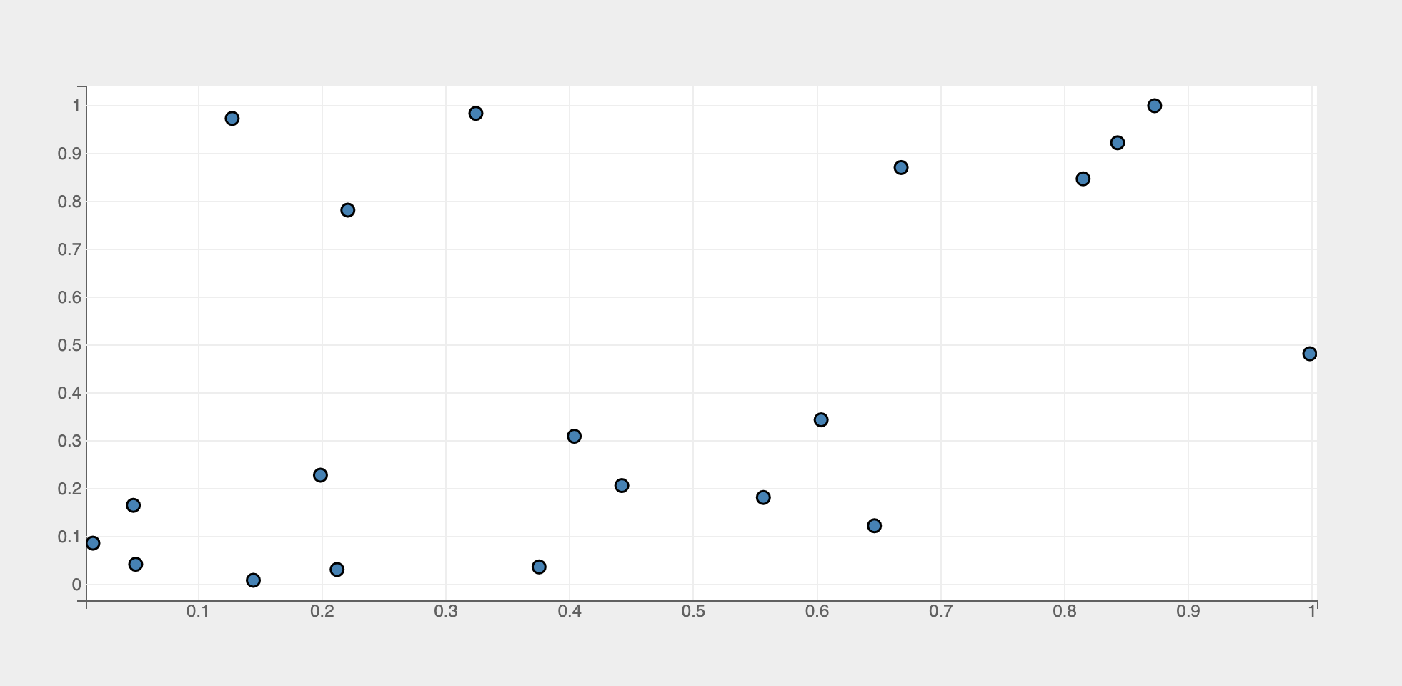
Tip
Adding a black stroke around the dots renders them well
Attributes can be updated in separate notebook cells or in callbacks when an event is triggered!
- make the marker
cross - no fill inside the marker
In Place Updates
The output cell containing the chart will be automatically updated whenever the figure or mark attributes are updated! The figure or marks should never be recreated!
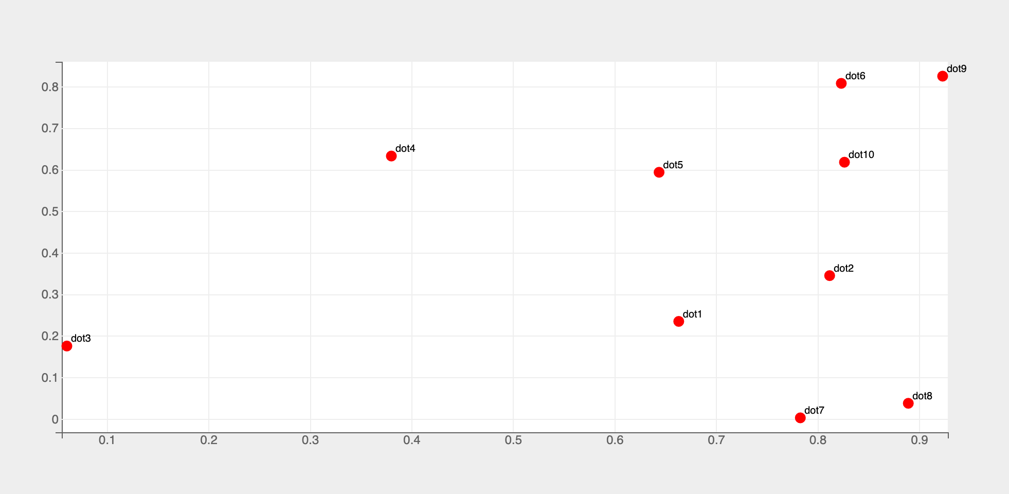
Labels
Labels for dots can be added by using the names attribute
fig = plt.figure()

x, y = np.random.rand(2, 10)
names = [f"dot{i+1}" for i in range(10)]
line = plt.scatter(x, y, colors=["red"], names=names, apply_clip=False)
plt.show()
Tip
Setting the Mark style attribute apply_clip to False prevents labels from getting clipped off the figure
Multiple Dimensions
Multiple dimensions can be encoded in a scatter chart by using additional data attributes like size, color etc.
Below is an example of a scatter plot of returns (dummy data) of two stocks with color encoding the chronology
import pandas as pd

# prepare dummy returns data for two stocks
import pandas as pd

# prepare dummy returns data for two stocks
dates = pd.date_range(start="2023-01-01", periods=30)
returns = np.random.randn(30, 2) * 0.01
df = pd.DataFrame(returns, index=dates, columns=["Stock1", "Stock2"])

dates, returns1, returns2 = df.index, df["Stock1"], df["Stock2"]

fig = plt.figure(fig_margin=dict(top=60, bottom=60, left=60, right=120)) # (1)!

axes_options = {
    "x": dict(label="Stock 1", tick_format=".0%"),
    "y": dict(label="Stock 2", tick_format=".0%"),
    "color": dict( # (2)!
        tick_format="%b-%d", num_ticks=5, label="Date",
        orientation="vertical", side="right"
    ),
}
scatter = plt.scatter(
    returns1, returns2, color=dates,
    stroke="black",
    axes_options=axes_options,
)
fig
- Provide enough right margin to accommodate the color bar
- Color bar attributes
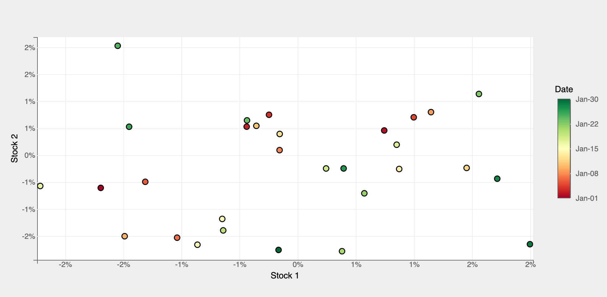
For a comprehensive example of encoding multi-dimensional data in a bubble chart, checkout the Wealth Of Nations notebook in bqplot-gallery.
Interactions
Tooltips
Tooltips can be added by setting the tooltip attribute to a Tooltip instance
import bqplot as bq

fig = plt.figure()
x, y = np.random.rand(2, 20)
tooltip = bq.Tooltip(fields=["x", "y"], formats=[".2f", ".2f"])
scatter = plt.scatter(x, y, colors=["green"], stroke="black",
                      tooltip=tooltip)
fig
Adding/Moving points
New points can be added by clicking on the chart and existing points can be moved using a mouse pointer. x and y data attributes will be automatically updated as new points are added or existing points are moved around!
By implementing and registering callback functions we can achieve the desired behavior when points are added or updated.
Set interactions = {"click": "add"} to add points on mouse clicks. x and y data attributes will be automatically updated when new points are added!
Set enable_move=True to move points. x and y data attributes will be automatically updated as points are moved around!
Selecting Points
Discrete points can be selected via mouse clicks or a continuous region of points can be selected by using Selectors.
The selected attribute of scatter will be automatically updated in both the cases. Note that selected attribute is a list of indices of the selected points!
Tip
Use the selected_style and unselected_style attributes (which are dicts) to apply CSS styling for selected and un-selected points respectively
Callbacks can be registered on changes to selected attribute.
To select discrete set of points set interactions = {"click": "select"}. Single point can be selected by a mouse click. Mouse click + command key (mac) (or control key (windows)) lets you select multiple points.
fig = plt.figure()
x, y = np.random.rand(2, 20)
scatter = plt.scatter(x, y, colors=["green"], stroke="black",
                      interactions={"click": "select"},
                      unselected_style={"opacity": "0.3"})

# callback to invoke when points are selected
def on_select(*args):
    selected_indices = scatter.selected
    if selected_indices is not None:
        selected_x = scatter.x[selected_indices]
        selected_y = scatter.y[selected_indices]

        # do something with selected data

# register callback on selected attribute
scatter.observe(on_select, names=["selected"])

fig
Use BrushSelector to select points in a rectangular region or a Lasso Selector to select points in a closed free-form region. Check Selectors page for more details on how to setup and use various selectors.
Let's look at an example using a brush selector.
import bqplot as bq

fig = plt.figure()
x, y = np.random.rand(2, 20)
scatter = plt.scatter(x, y, colors=["green"], stroke="black",
                    unselected_style={"opacity": "0.3"})
xs, ys = scatter.scales["x"], scatter.scales["y"]

selector = bq.interacts.BrushSelector(x_scale=xs, y_scale=ys, marks=[scatter])
fig.interaction = selector

# callback to invoke when points are selected
def on_select(*args):
    selected_indices = scatter.selected
    if selected_indices is not None:
        selected_x = scatter.x[selected_indices]
        selected_y = scatter.y[selected_indices]

        # do something with selected data

# register callback on selected attribute
scatter.observe(on_select, names=["selected"])

fig
Example Notebooks
For detailed examples of scatter plots, refer to the following example notebooks