Gridheatmap
The GridHeatMap mark provides the following features:
- Plot a single 2d array of color values for a single array x-values and y-values
Attributes
Data Attributes
Style Attributes
Let's now look at examples of constructing grid heat maps using the pyplot API
pyplot
The function for plotting gridheatmap charts in pyplot is plt.gridheatmap. It takes two main arguments:
- color vector of color values
- row vector of labels for rows of the data
- column vector of labels for the columns of the data
For further customization, any of the attributes above can be passed as keyword args.
Code Examples
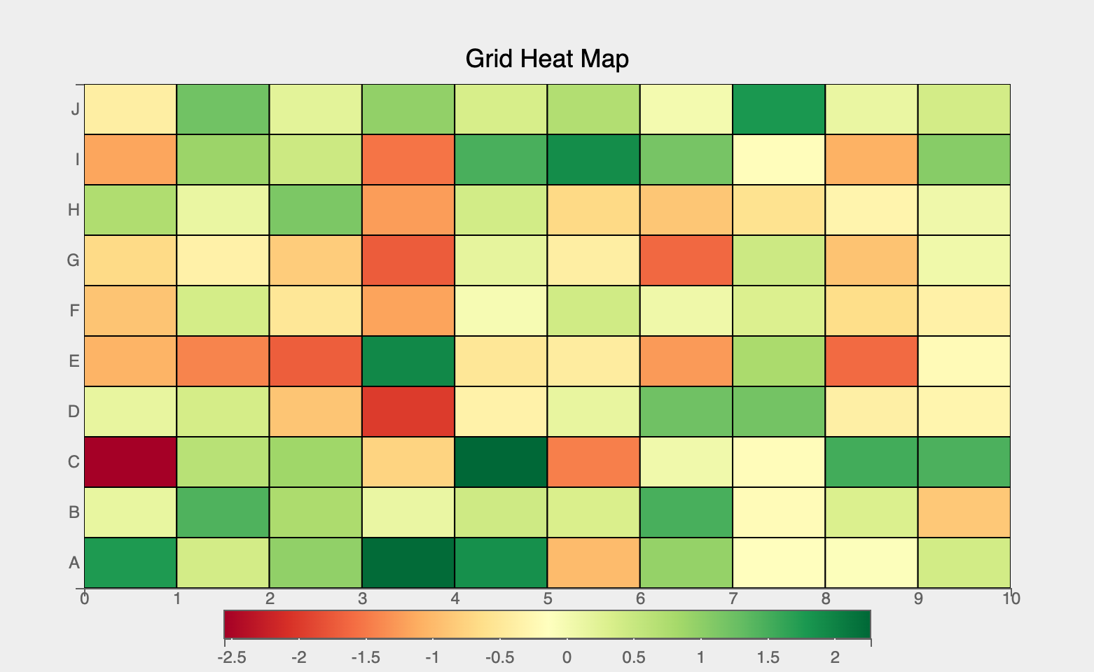
Simple Grid Heat Map
import bqplot.pyplot as plt
import numpy as np

data = np.random.randn(10, 10)
row = list("ABCDEFGHIJ")
column = np.arange(10)

fig = plt.figure(title="Grid Heat Map", padding_y=0)
grid_map = plt.gridheatmap(color=data, row=row, column=column)
fig
Attributes can be updated in separate notebook cells or in callbacks when an event is triggered!
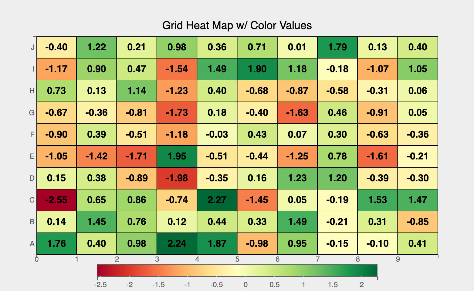
Cell Text Values
Often colors might obscure the values of each cell in the map. To avoid confusion, we can plot the explicit numeric values over each cell. Any CSS styles applicable to text can be passed as a dict to the font_style attribute to style the text.
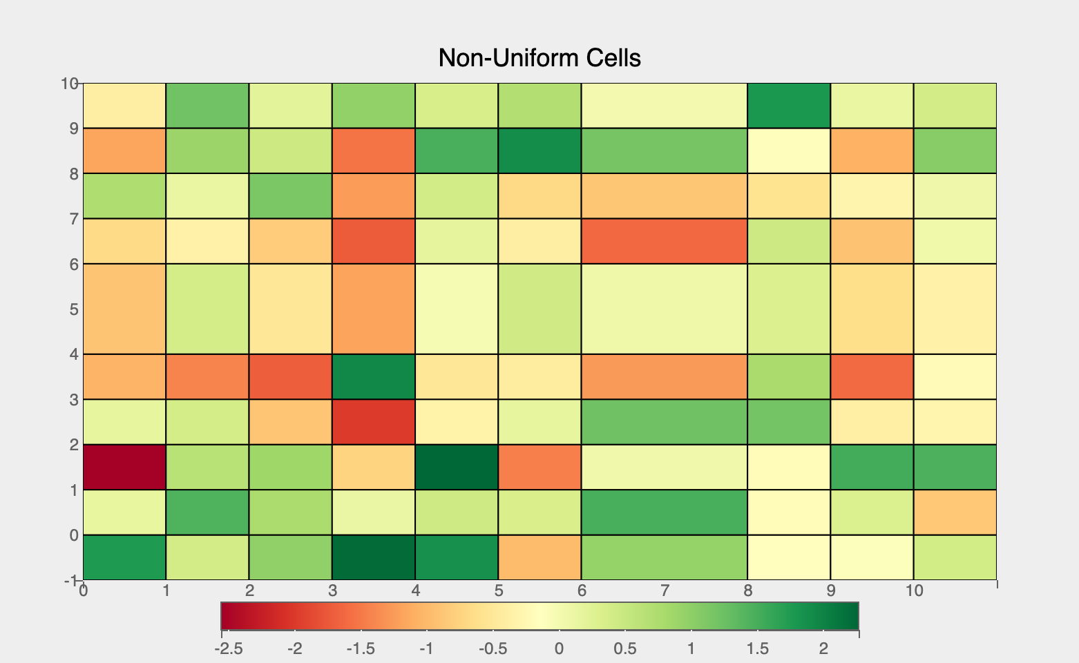
Non-Uniform Cells
Grid Heat Maps will adjust to any scalar non-uniform inputs in either the column or row arguments. For example, if we have an uneven grid where certain cells vary in size, Grid Heat Maps will reflect this size on the plot as shown below.
row = np.arange(10)
row[5:] = np.arange(6, 11)
column = np.arange(10)
column[7:] = np.arange(8, 11)

fig = plt.figure(title="Non-Uniform Cells",
                 padding_y=0)

grid_map = plt.gridheatmap(color=data,
                           row=row,
                           column=column)
fig
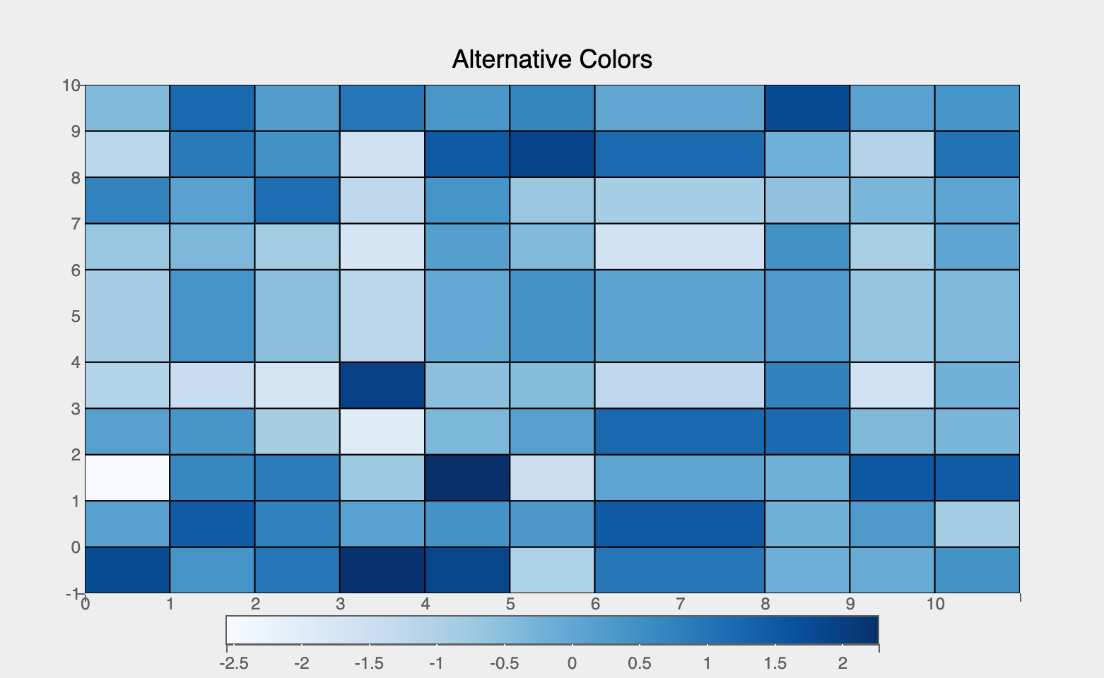
Alternative Color Schemes
By adjusting the scales for the color values used in the heatmap, we can change the plot to use any color scheme we desire.
Using color data attribute we can encode a third dimension (apart from x and y) using color scales, like so:
import bqplot as bq

fig = plt.figure(title='Alternative Colors', padding_y=0)
grid_map = plt.gridheatmap(
    color=data,
    row=row,
    column=column,
    scales={"color": bq.ColorScale(scheme="Blues")}
)

fig
Interactions
Tooltips
Tooltips can be added by setting the tooltip attribute to a Tooltip instance
import bqplot as bq

row = list("ABCDEFGHIJ")
column = np.arange(10)
tooltip = bq.Tooltip(fields=["row", "column", "color"],
                     formats=["", ".2f", ".2f"])

fig = plt.figure(title="Tooltip", padding_y=0.0)
grid_map = plt.gridheatmap(
    data,
    row=row,
    column=column,
    tooltip=tooltip
)
fig
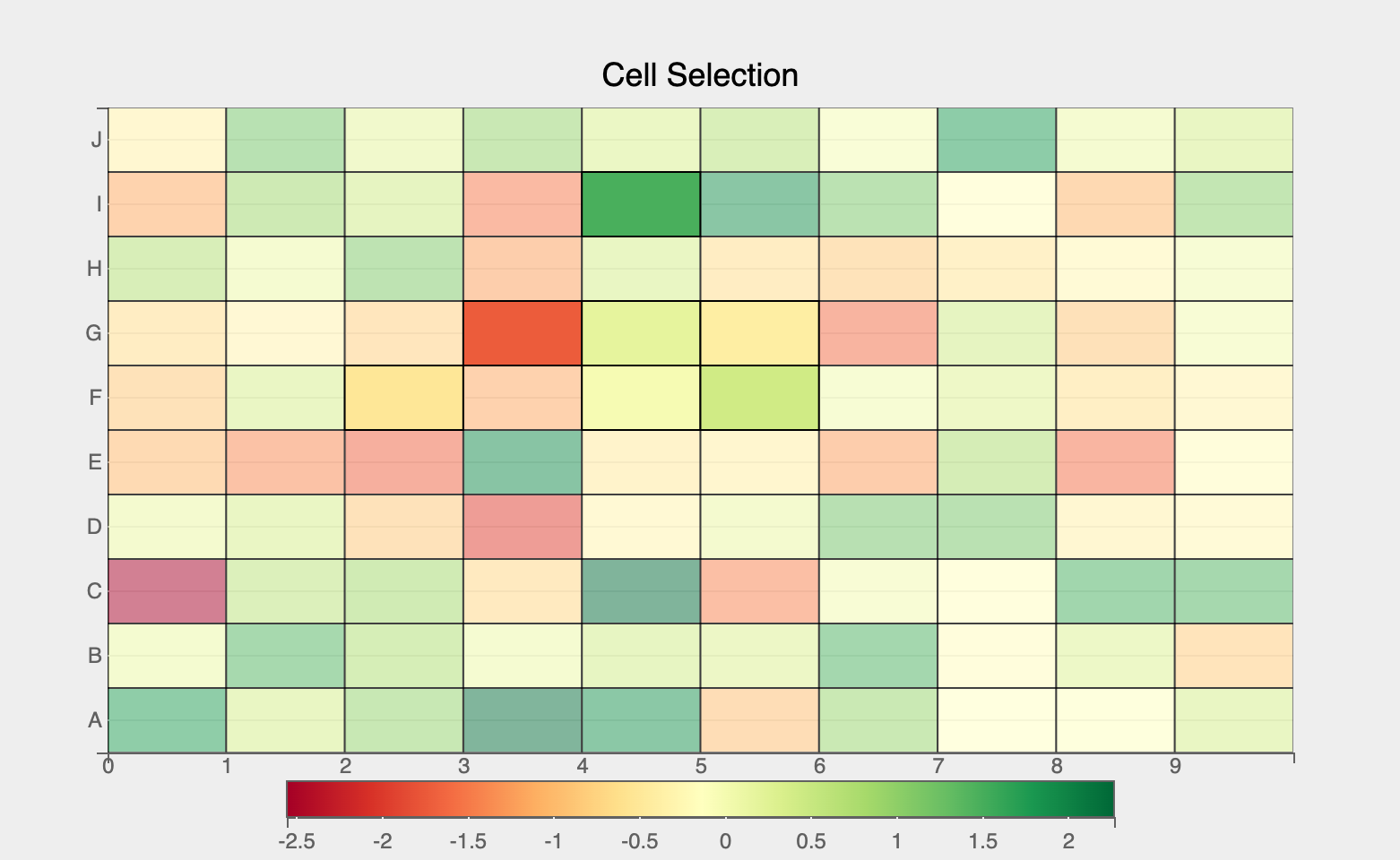
Selecting Cells
Discrete cell(s) can be selected via mouse clicks. The selected attribute of the gridheatmap mark will be automatically updated. Note that selected attribute is a list of indices of the rows and columns for the selected cells!
Tip
Use the selected_style and unselected_style attributes (which are dicts) to apply CSS styling for selected and un-selected cells respectively
Callbacks can be registered on changes to selected attribute. To select discrete set of cells set interactions = {"click": "select"}. Single cells can be selected by a mouse click. Mouse click + command key (mac) (or control key (windows)) lets you select multiple cells.
fig = plt.figure(title="Cell Selection", padding_y=0)
row = list("ABCDEFGHIJ")
column = np.arange(10)

grid_map = plt.gridheatmap(
    data,
    row=row,
    column=column,
    interactions={"click": "select"},
    unselected_style={"opacity": "0.5"}
)

# callback to invoke when cells are selected
def on_select(*args):
    selected_indices = grid_map.selected

    # do something with selected data
    print(selected_indices)

# register callback on selected attribute
grid_map.observe(on_select, names=["selected"])

fig
Example Notebooks
For detailed examples of gridheatmap plots, refer to the following example notebooks