Label
The Label mark provides the following features:
- Plot a single or multiple labels for an array of x-values and y-values
Attributes
Data Attributes
Style Attributes
Let's now look at examples of adding labels using the pyplot API
pyplot
The function for plotting labels in pyplot is plt.label. It takes three main arguments:
- text vector of text label values
- x vector of x values representing the x coordinates for the labels
- y vector of y values representing the y coordinates for the labels
For further customization, any of the attributes above can be passed as keyword args.
Code Examples
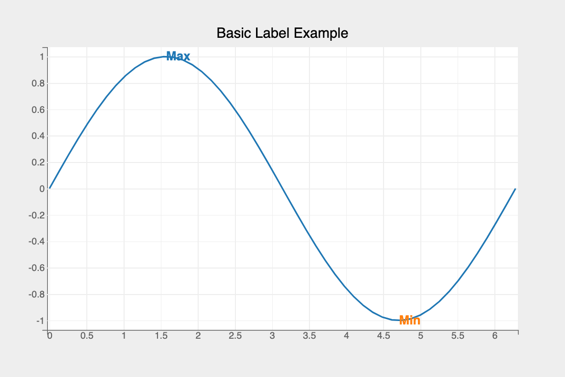
Simple Label
import numpy as np
import bqplot.pyplot as plt

fig = plt.figure(title="Basic Label Example")
x   = np.linspace(0, 2 * np.pi)
y   = np.sin(x)

line   = plt.plot(x, y)
label  = plt.label(
    text=["Max", "Min"],
    x=[.5 * np.pi, 1.5 * np.pi],
    y=[1, -1]
)
fig
Tip
To render labels professionally it's better to offset the label to avoid obscuring the true graph below. To do so, set the x_offset and y_offset attrbiutes (which accepts values in pixels), like so:
Attributes can also be updated in separate notebook cells or in callbacks when an event is triggered!
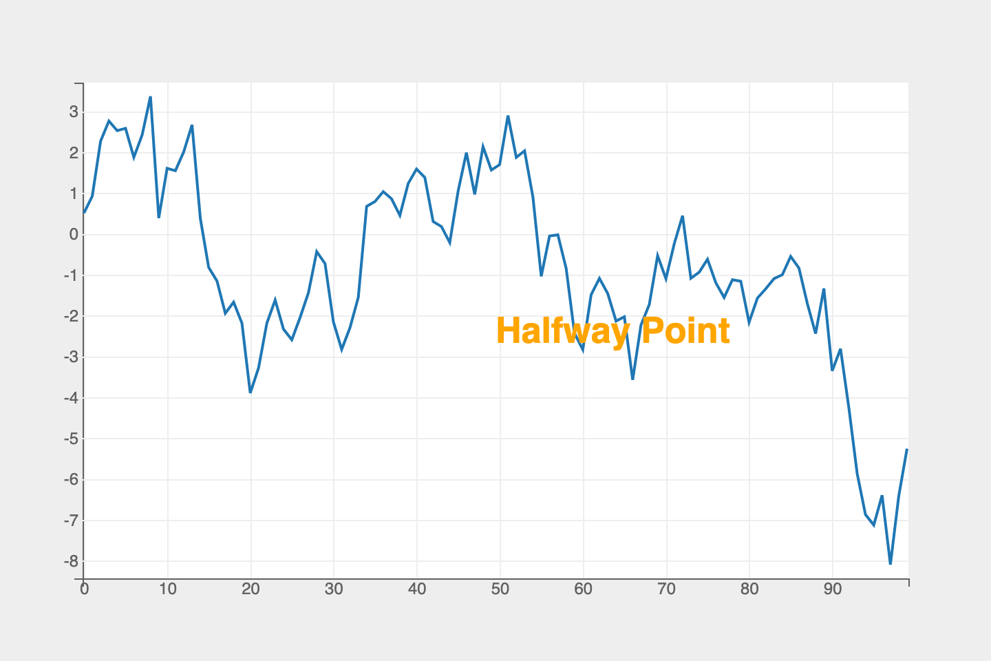
Figure Coordinates
Use the coordinates relative to the figure to more easily plot labels for important features.
fig   = plt.figure()
y     = np.cumsum(np.random.randn(100))
line  = plt.plot(np.arange(y.size), y_data)
label = plt.label(
    ["Halfway Point"],
    default_size=26,
    font_weight="bolder",
    colors=["orange"]
)

label.x = [0.5]
label.y = [0.5]
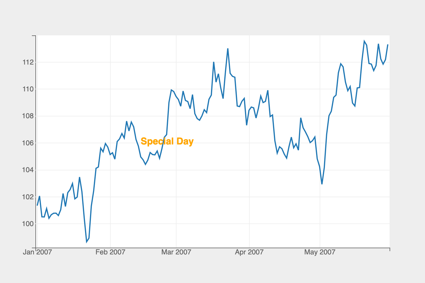
Further, we can use values expressed in the units of the data. For example, if we consider a time series, we might want to label a specific date. Rather than calculating the position of the data with respect to the figure, we can simply pass in the date to the label function.
fig = plt.figure()
y   = pd.Series(
    np.cumsum(np.random.randn(150)) + 100,
    name="Time Series",
    index=pd.date_range(start="01-01-2007", periods=150),
)

lines = plt.plot(y.index, y)
label = plt.label(["Special Day"],
                  x=[np.datetime64("2007-02-14")],
                  colors=["orange"])

labels.y = [0.5]
fig
Interactions
Movable Labels
Labels can be dynamically moved in the figure by enabling the enable_move flag attribute as shown below:
Example Notebooks
For detailed examples of bar plots, refer to the following example notebooks