Pyplot
pyplot is a context based functional API offering meaningful defaults. It's a concise API and very similar to matplotlib's pyplot. Users new to bqplot should use pyplot as a starting point.
Steps for building plots in pyplot:
- Create a figure object using
plt.figure - (Optional steps)
- Scales can be customized using
plt.scalesfunction (by defaultLinearScaleinstances are created for all data attributes) - Axes options can customized by passing a dict to axes_options argument in the marks' functions
- Scales can be customized using
- Create marks using pyplot functions like
plt.plot,plt.bar,plt.scatteretc. (All the marks created will be automatically added to the figure object created in step 1) - Render the figure object using the following approaches:
- Using plt.show function which renders the figure in the current context along with toolbar for panzoom etc.
- Using
displayon the figure object created in step 1 (toolbar doesn't show up in this case)
pyplot comes with many helper functions. A few are listed below:
plt.xlim: sets the domain bounds of the current x scaleplt.ylim: sets the domain bounds of the current y scaleplt.grids: shows/hides the axis grid linesplt.xlabel: sets the X-Axis labelplt.ylabel: sets the Y-Axis labelplt.hline: draws a horizontal line at a specified levelplt.vline: draws a vertical line at a specified level
Let's look at a few examples (Object Model usage available here):
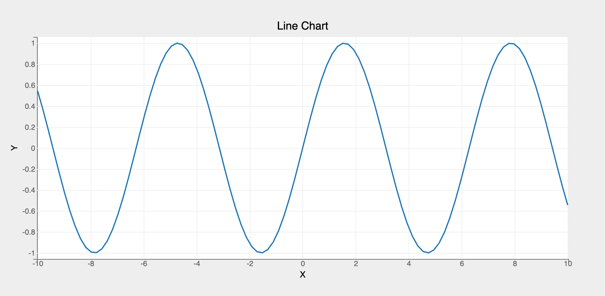
Line Chart
import bqplot.pyplot as plt
import numpy as np

# create data vectors x and y to plot using a Lines mark
x = np.linspace(-10, 10, 100)
y = np.sin(x)

# 1. Create the figure object
fig = plt.figure(title="Line Chart")

# 2. By default axes are created with basic defaults. If you want to customize the axes create
# a dict and pass it to axes_options argument in the marks
axes_opts = {"x": {"label": "X"}, "y": {"label": "Y"}}

# 3. Create a Lines mark by calling plt.plot function
line = plt.plot(
    x=x, y=y, axes_options=axes_opts
)  # note that custom axes options are passed to the mark function

# 4. Render the figure using plt.show() (displays toolbar as well)
plt.show()
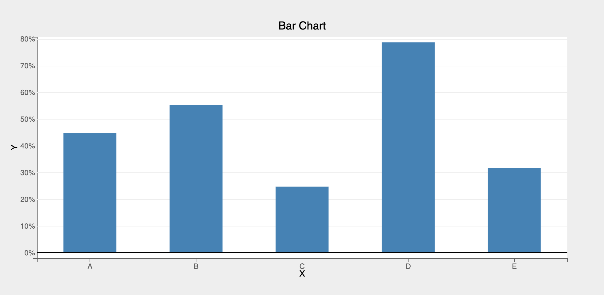
Bar Chart
For creating other marks (like scatter, pie, bars, etc.), only step 2 needs to be changed. Lets look an example to create a bar chart:
# first, create data vectors x and y to plot a bar chart
x = list("ABCDE")
y = np.random.rand(5)

# 1. Create the figure object
fig = plt.figure(title="Bar Chart")

# 2. Customize the axes options
axes_opts = {
    "x": {"label": "X", "grid_lines": "none"},
    "y": {"label": "Y", "tick_format": ".0%"},
}

# 3. Create a Bars mark by calling plt.bar function
bar = plt.bar(x=x, y=y, padding=0.5, axes_options=axes_opts)

# 4. directly display the figure object created in step 1 (note that the toolbar no longer shows up)
fig
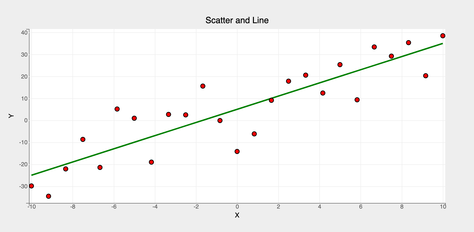
Multiple Marks
Multiple marks can be rendered in the same figure. It's as easy as creating marks one after another. They'll all be added to the same figure!
# first, let's create two vectors x and y
x = np.linspace(-10, 10, 25)
y = 3 * x + 5
y_noise = y + 10 * np.random.randn(25)  # add some random noise to y

# 1. Create the figure object
fig = plt.figure(title="Scatter and Line")

# 3. Create line and scatter marks
# additional attributes (stroke_width, colors etc.) can be passed as attributes
# to the mark objects as needed
line = plt.plot(x=x, y=y, colors=["green"], stroke_width=3)
scatter = plt.scatter(x=x, y=y_noise, colors=["red"], stroke="black")

# setting x and y axis labels using pyplot functions. Note that these functions
# should be called only after creating the marks
plt.xlabel("X")
plt.ylabel("Y")

# 4. render the figure
fig
Summary
pyplot is a simple and intuitive API. It's available for all the marks except MarketMap. It should be used in almost all the cases by default since it offers a concise API compared to the Object Model. For detailed usage refer to the mark examples using pyplot