Lines
The Lines mark provides the following features:
- Plot a single or multiple arrays of y-values for a single or multiple arrays of x-values
- Style the line mark in different ways, by setting different attributes such as the colors, line_style, markers, stroke_width etc.
- Specify a marker at each point passed to the line. The marker can be a shape which is at the data points between which the line is interpolated and can be set through the
markerattribute - Fill lines with colors (in-between or below) to create area charts
Attributes
Data Attributes
Style Attributes
Note
Lines are implemented as multi-line charts by default. Hence, style attributes like colors, opacities etc. are lists not strings!
Line Styling
Following line styling options are supported:
colors: color the line with a specific color. Note thatcolorsis a list which supports multi-line charts by default!line_style: Following styling options are supported: {solid, dashed, dotted, dash_dotted}marker: Following marker options are supported: {circle, cross, diamond, square, triangle-down, triangle-up, arrow, rectangle, ellipse, plus, crosshair, point}
Let's now look at examples of constructing lines using pyplot API
pyplot
The function for plotting lines is pyplot is plt.plot. It takes three arguments:
- x vector of x values
- y vector of y values. For multi-line chart
yshould be a list of arrays or a 2-d array - marker_str matplotlib style marker strings for styling the lines
For further customization, any of the attributes above can be passed as keyword args.
Code Examples
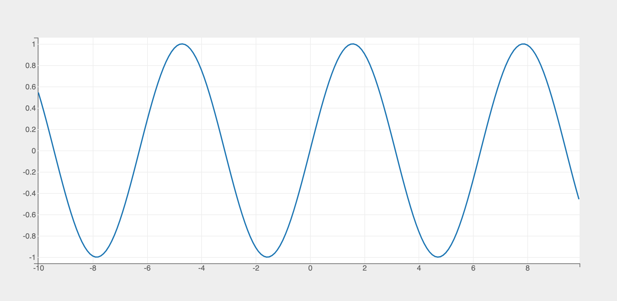
Simple Line Chart
import bqplot.pyplot as plt
import numpy as np

fig = plt.figure()

x = np.arange(-10, 10, .1)
y = np.sin(x)
line = plt.plot(x, y)
fig
Attributes can be updated in separate notebook cells or in callbacks when an event is triggered!
In Place Updates
The output cell containing the chart will be automatically updated whenever the figure or mark attributes are updated! The figure or marks should never be recreated!
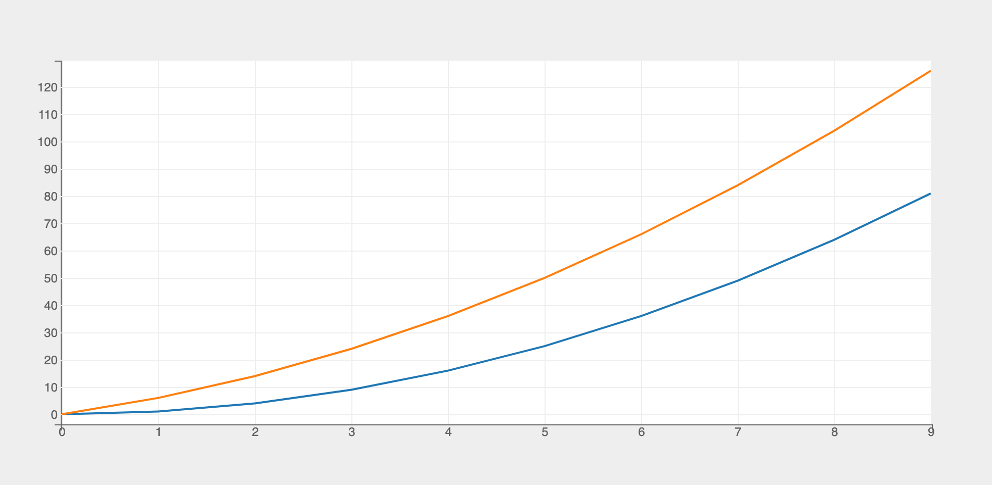
Multi Line Chart
To generate a multi-line chart y should be a list of arrays or a 2d numpy array.
import bqplot.pyplot as plt
import numpy as np

fig = plt.figure()

x = np.arange(10)
y = [x ** 2, x ** 2 + 5 * x]
line = plt.plot(x, y)
fig
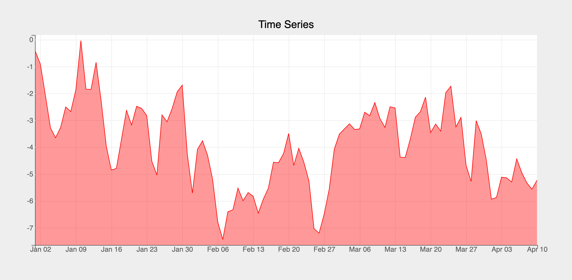
Time Series
If the dates are of type numpy.datetime64 then pyplot automatically infers a date scale for the x attribute. Otherwise a DateScale need to be explicitly specified using the plt.scales function
import bqplot as bq
import pandas as pd

import bqplot.pyplot as plt
import numpy as np

x = pd.date_range(start="2022-01-01", periods=100)
y = np.random.randn(100).cumsum()

fig = plt.figure(title="Time Series")
# create a date scale for x (not needed if dates are numpy.datetime64)
plt.scales(scales={"x": bq.DateScale()})
time_series_line = plt.plot(x, y, "r", stroke_width=1,
                            fill="bottom", # (1)!
                            fill_colors=["red"],
                            fill_opacities=[.4])
fig
- Adds a fill below the line
Marker Strings
pyplot supports the following marker strings a la matplotlib. Marker strings can be passed as a third argument in plt.plot function.
Following codes are supported:
Color
| Code | Value |
|---|---|
| b | blue |
| g | green |
| r | red |
| c | cyan |
| m | magenta |
| y | yellow |
| k | black |
Line Style
| Code | Value |
|---|---|
| : | dotted |
| -. | dash_dotted |
| -- | dashed |
| - | solid |
Marker
| Code | Value |
|---|---|
| o | circle |
| v | triangle-down |
| ^ | triangle-up |
| s | square |
| d | diamond |
| + | + |
| p | cross |
| x | plus |
| . | crosshair |
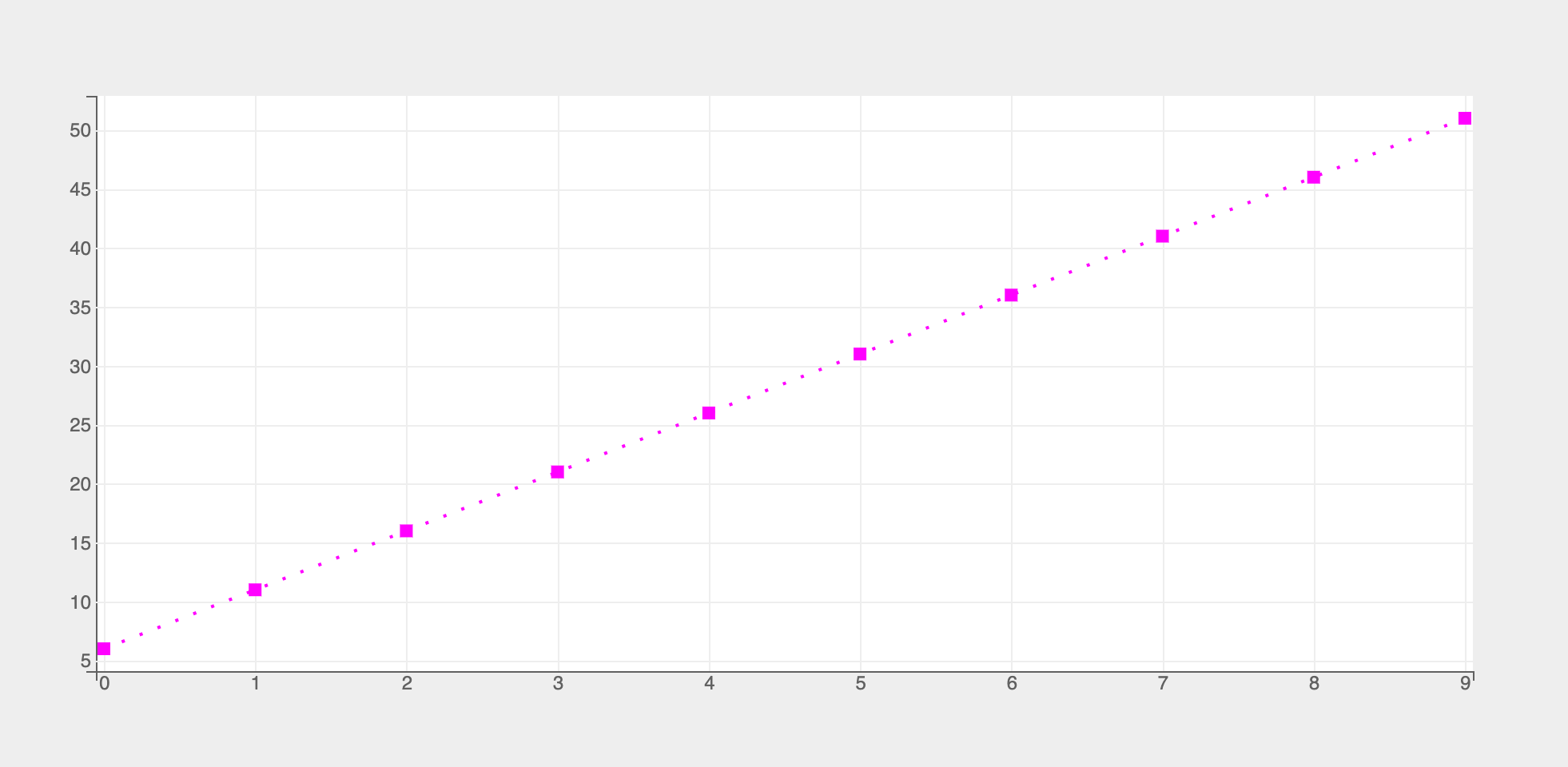
To create a marker string you can combine the one or more of the the three types of codes above in any order, like so:
Let's look at a code example:
- Magenta dotted line with a square marker
Few more examples of marker strings
- ms magenta line with square marker
- yo yellow line with circle marker
- -- dashed line
- -.d dash-dotted line with diamond marker
- g+: green dotted line with plus marker
Legends
To display legends you need to set the following attributes of plt.plot function:
labelsdisplay_legend
Let's look an example:
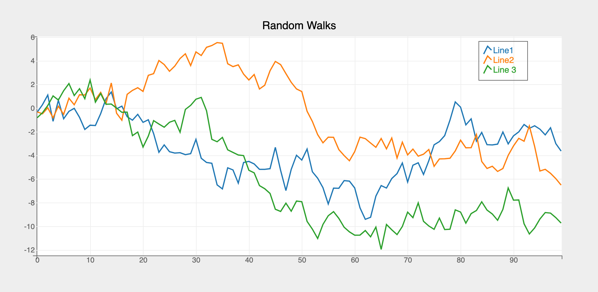
fig = plt.figure(title="Random Walks")
x = np.arange(100)
# three random walks
y = np.random.randn(3, 100).cumsum(axis=1)
lines = plt.plot(
    x, y,
    labels=["Line1", "Line2", "Line 3"],
    display_legend=True
)
fig
Legend Location
Location of the legend can be configured by setting the attribute legend_location in the figure constructor, like so:
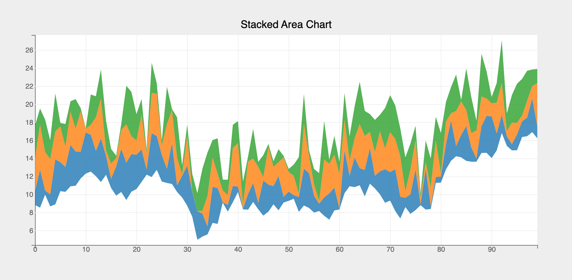
Area Charts
Area charts can be constructed from line charts by passing in the following attributes:
fillfill_colorfill_opacities
import bqplot as bq
import numpy as np

fig = plt.figure(title="Stacked Area Chart")
x = np.arange(100)
y1 = np.random.randn(100).cumsum() + 10
y2 = y1 + np.random.rand(100) * 5
y3 = y2 + np.random.rand(100) * 5
y4 = y3 + np.random.rand(100) * 5

lines = plt.plot(x, [y1, y2, y3, y4], stroke_width=0,
                 fill="between",
                 fill_opacities=[.8] * 4)
fig
Example Notebooks
For detailed examples of line plots, refer to the following example notebooks