Object Model
bqplot is based on Grammar of Graphics paradigm. The Object Model provides the user an object-oriented interface for building plots. This means the API is verbose but fully customizable.
Following are the core components of the Object Model:
The following are the steps to build a Figure in bqplot using the Object Model:
- Build the scales for
xandyquantities using theScaleclasses (Scales map the data into pixels in the figure) - Build the marks using the
Markclasses. Marks represent the core plotting objects (lines, scatter, bars, pies etc.). Marks take the scale objects created in step 1 as arguments - Build the axes for
xandyscales - Finally create a figure using
Figureclass. Figure takes marks and axes as inputs. Figure object is a instance ofDOMWidgetand can be rendered like any other jupyter widgets
Let's look a few examples (pyplot usage available here):
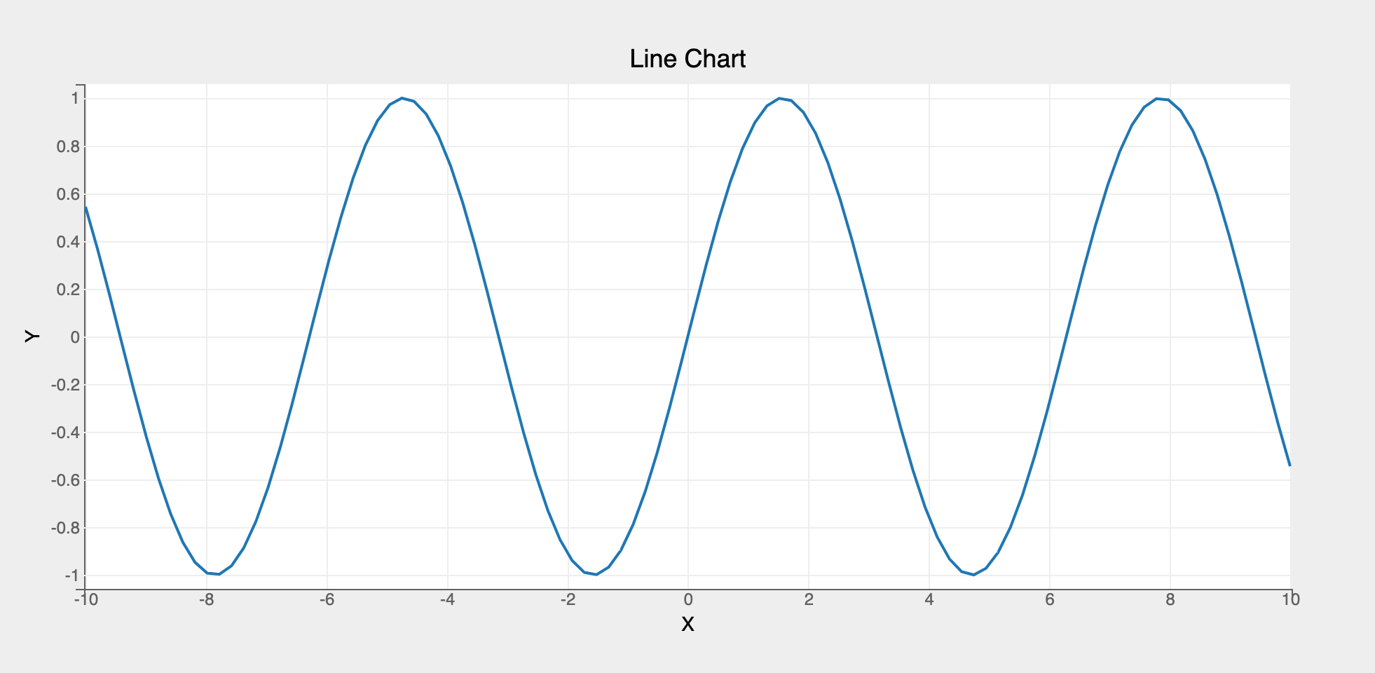
Line Chart
# first, create two vectors x and y to plot using a Lines mark
import bqplot as bq
import numpy as np

x = np.linspace(-10, 10, 100)
y = np.sin(x)

# 1. Create the scales
xs = bq.LinearScale()
ys = bq.LinearScale()

# 2. Create the axes for x and y
xax = bq.Axis(scale=xs, label="X")
yax = bq.Axis(scale=ys, orientation="vertical", label="Y")

# 3. Create a Lines mark by passing in the scales
line = bq.Lines(x=x, y=y, scales={"x": xs, "y": ys})

# 4. Create a Figure object by assembling marks and axes
fig = bq.Figure(marks=[line], axes=[xax, yax], title="Line Chart")

# 5. Render the figure using display or just as is
fig
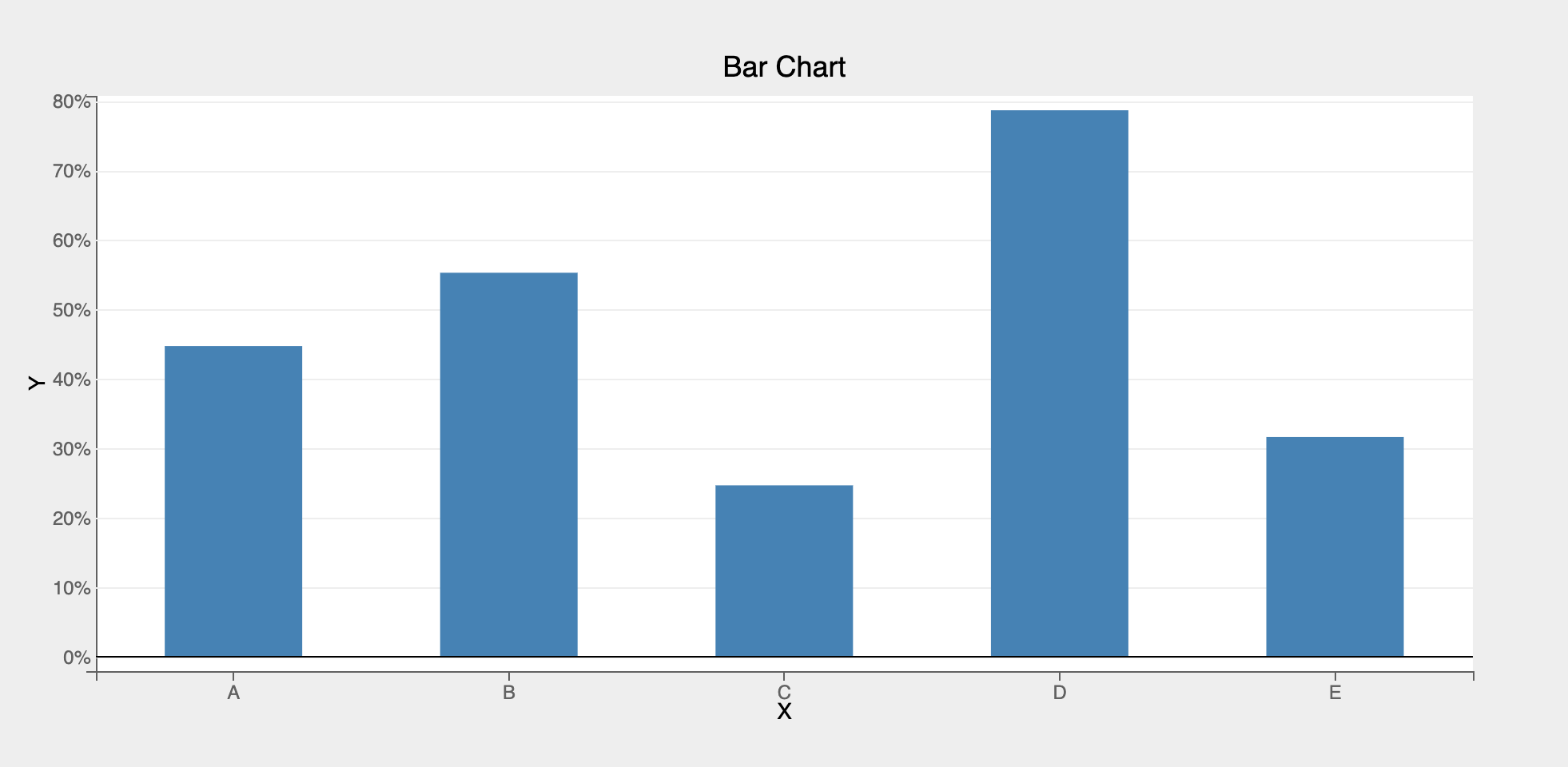
Bar Chart
For creating other marks (like scatter, pie, bars, etc.), only step 3 needs to be changed. Lets look a simple example to create a bar chart:
# create two vectors x and y to plot a bar chart
x = list("ABCDE")
y = np.random.rand(5)

# 1. Create the scales
xs = bq.OrdinalScale()  # ordinal scale to represent categorical data
ys = bq.LinearScale()

# 2. Create the axes for x and y
xax = bq.Axis(scale=xs, label="X", grid_lines="none")  # no grid lines needed for x
yax = bq.Axis(
    scale=ys, orientation="vertical", label="Y", tick_format=".0%"
)  # note the use of tick_format to format ticks

# 3. Create a Bars mark by passing in the scales
bar = bq.Bars(x=x, y=y, scales={"x": xs, "y": ys}, padding=0.5)

# 4. Create a Figure object by assembling marks and axes
bq.Figure(marks=[bar], axes=[xax, yax], title="Bar Chart")
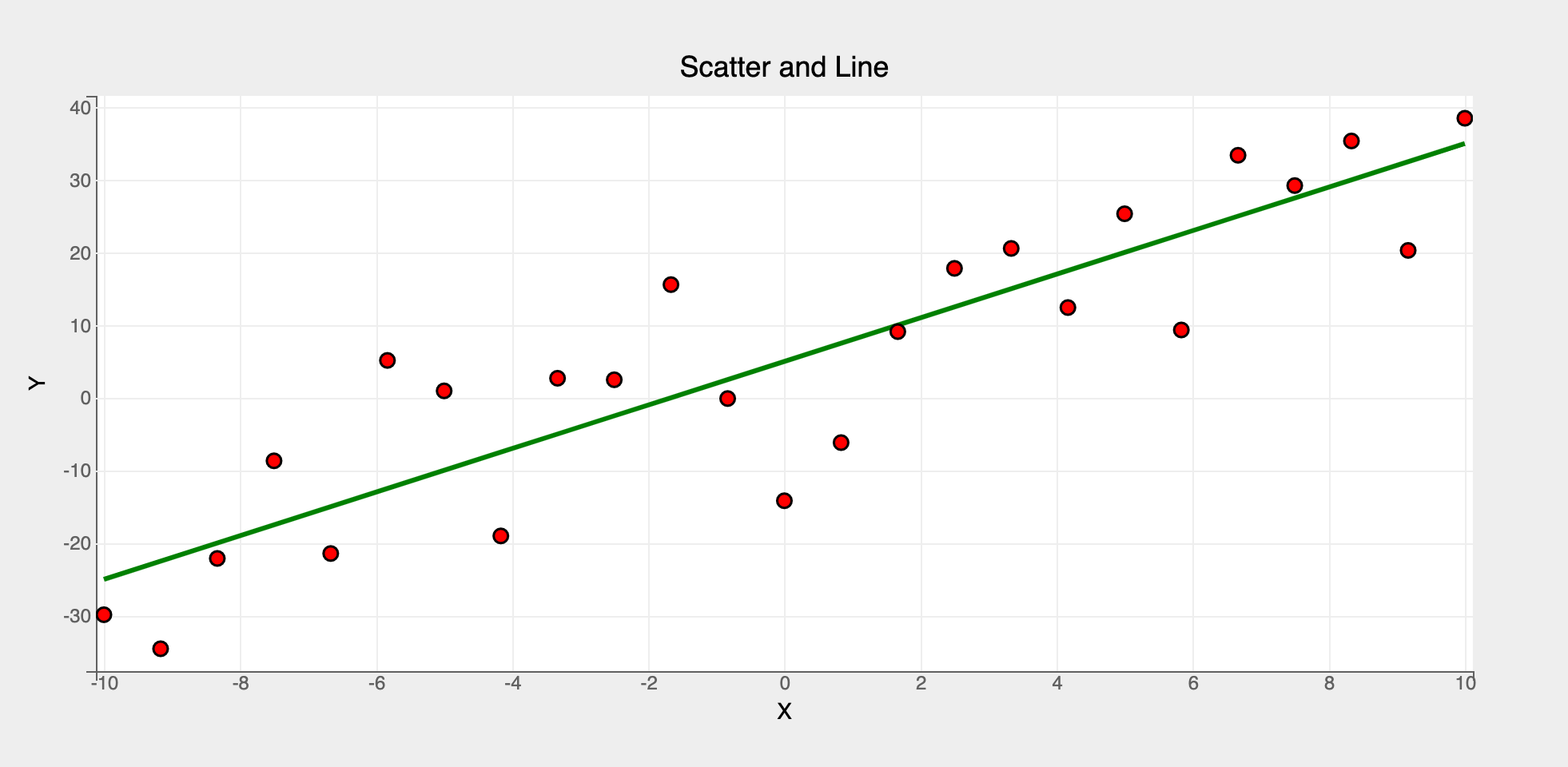
Multiple Marks
Multiple marks can be rendered in a figure. It's as easy as passing a list of marks when constructing the Figure object!
x = np.linspace(-10, 10, 25)
y = 3 * x + 5
y_noise = y + 10 * np.random.randn(25)  # add some random noise to y

# 1. Create the scales
xs = bq.LinearScale()
ys = bq.LinearScale()

# 2. Create the axes for x and y
xax = bq.Axis(scale=xs, label="X")
yax = bq.Axis(scale=ys, orientation="vertical", label="Y")

# 3. Create a Lines and Scatter marks by passing in the scales
# additional attributes (stroke_width, colors etc.) can be passed as attributes
# to the mark objects as needed
line = bq.Lines(x=x, y=y, scales={"x": xs, "y": ys}, colors=["green"], stroke_width=3)
scatter = bq.Scatter(
    x=x, y=y_noise, scales={"x": xs, "y": ys}, colors=["red"], stroke="black"
)

# 4. Create a Figure object by assembling marks and axes
# pass both the marks (line and scatter) as a list to the marks attribute
bq.Figure(marks=[line, scatter], axes=[xax, yax], title="Scatter and Line")
Summary
Object Model is a verbose but fully customizable object-oriented API for plotting. Lower level constructs like scales, axes etc. have to explicitly constructed.
For detailed usage refer to the example notebooks using Object Model.
Object Model can be used to build re-usable plotting widgets and widget libraries. More details can be found in [here]